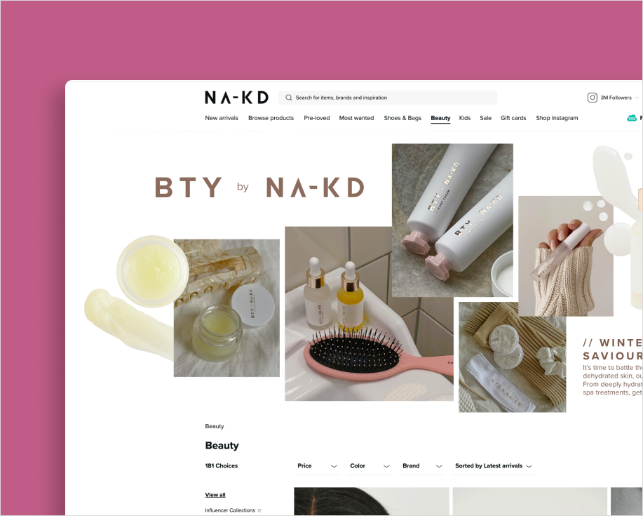
NA-KD . Landing pages . 2021
25 de junho de 2025
Overview
In collaboration with a multidisciplinary team, my thesis partner and I aim to refine the information architecture and visual design of the company's intranet to enhance the overall user experience.
Research & Analysis:
The project involves conducting user and stakeholder research to identify and understand different user groups and their needs, ensuring the solution is aligned with actual usage patterns and expectations.
Role: UX researcher, UI designer | Main tool: Figma | 2025 | Customer: DevPort
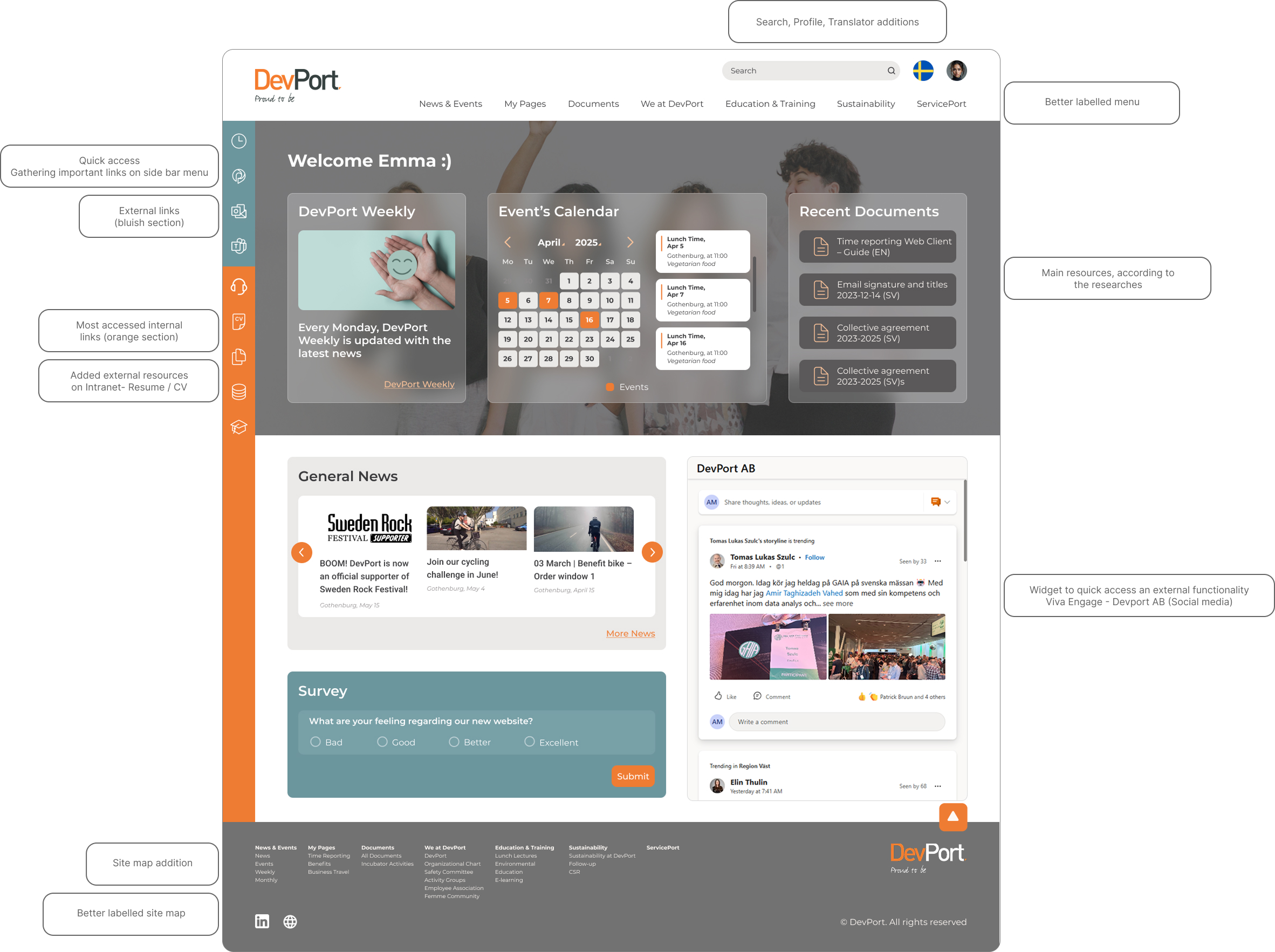
Understanding Needs
Before starting, it was essential to identify stakeholder needs, company goals, and desired user experience.
Central Hub Goal
The intranet was intended to act as a central hub connecting users to company resources.
Fragmented Tools
Existing tools operated in parallel, leading to poor accessibility and ineffective navigation.
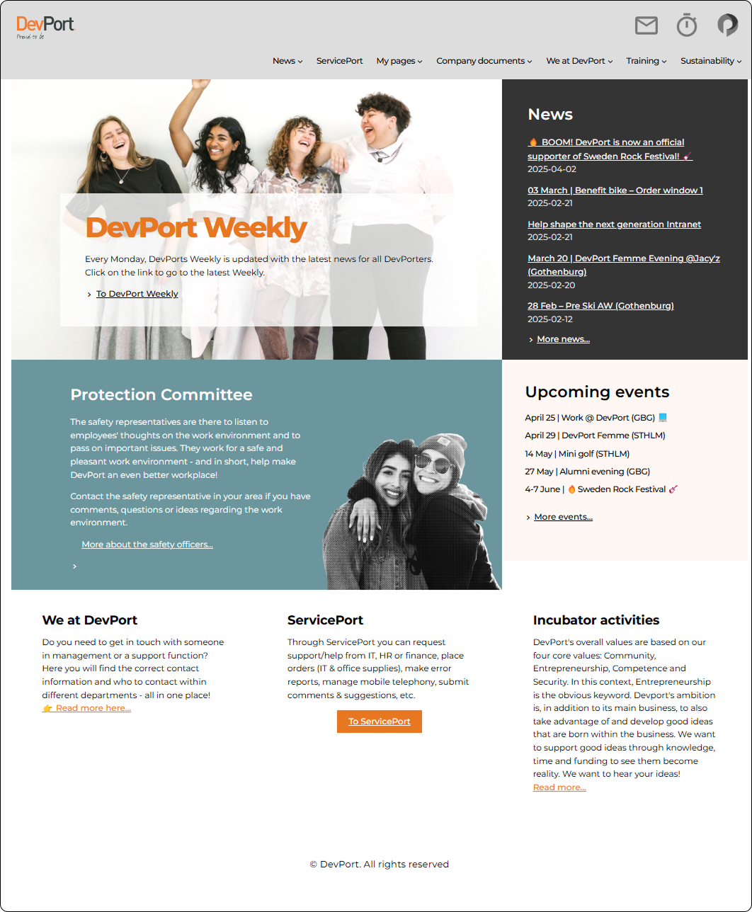
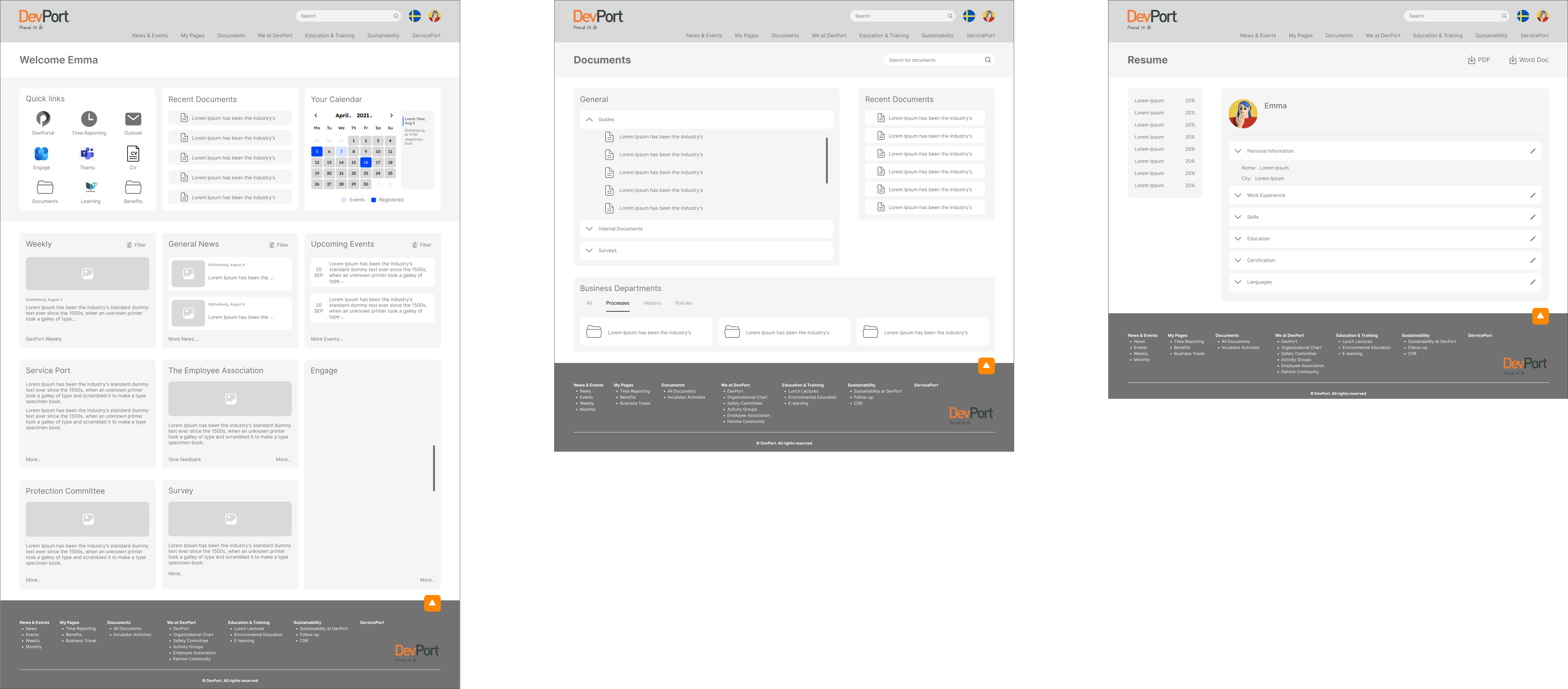
Previous intranet - Home page
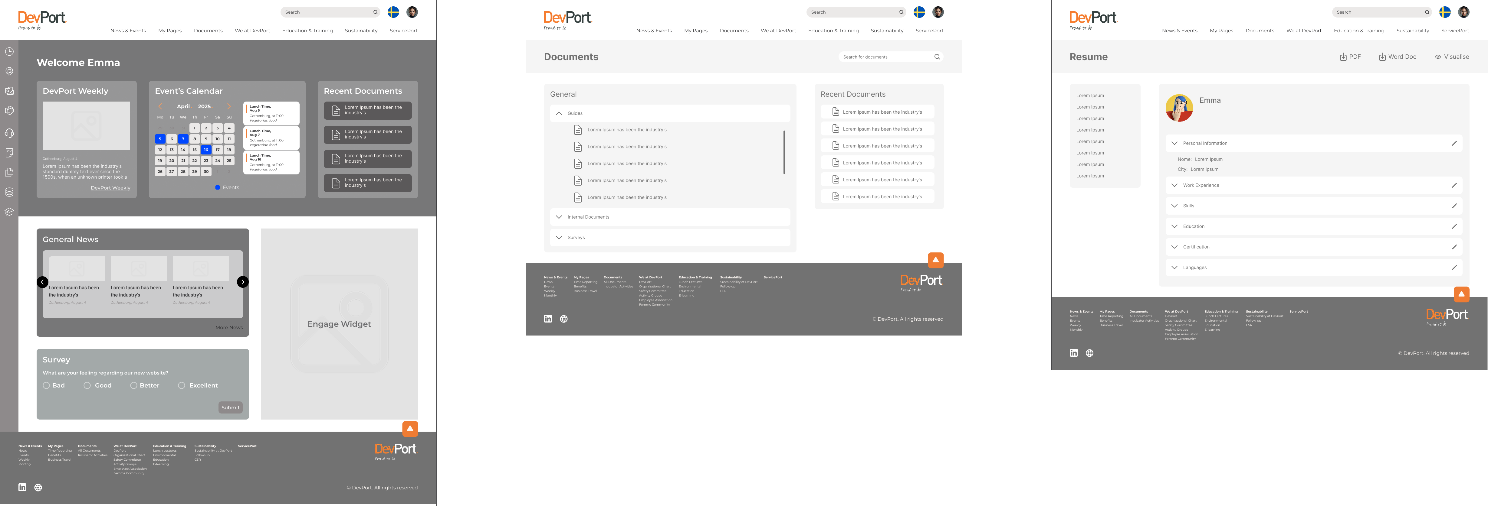
Final prototype - Home page
Through the research process, we were able to align
user requirements with
company goals. Using the
mid-fidelity prototype, we conducted
usability testing to validate key design decisions.
Final prototype - Main page
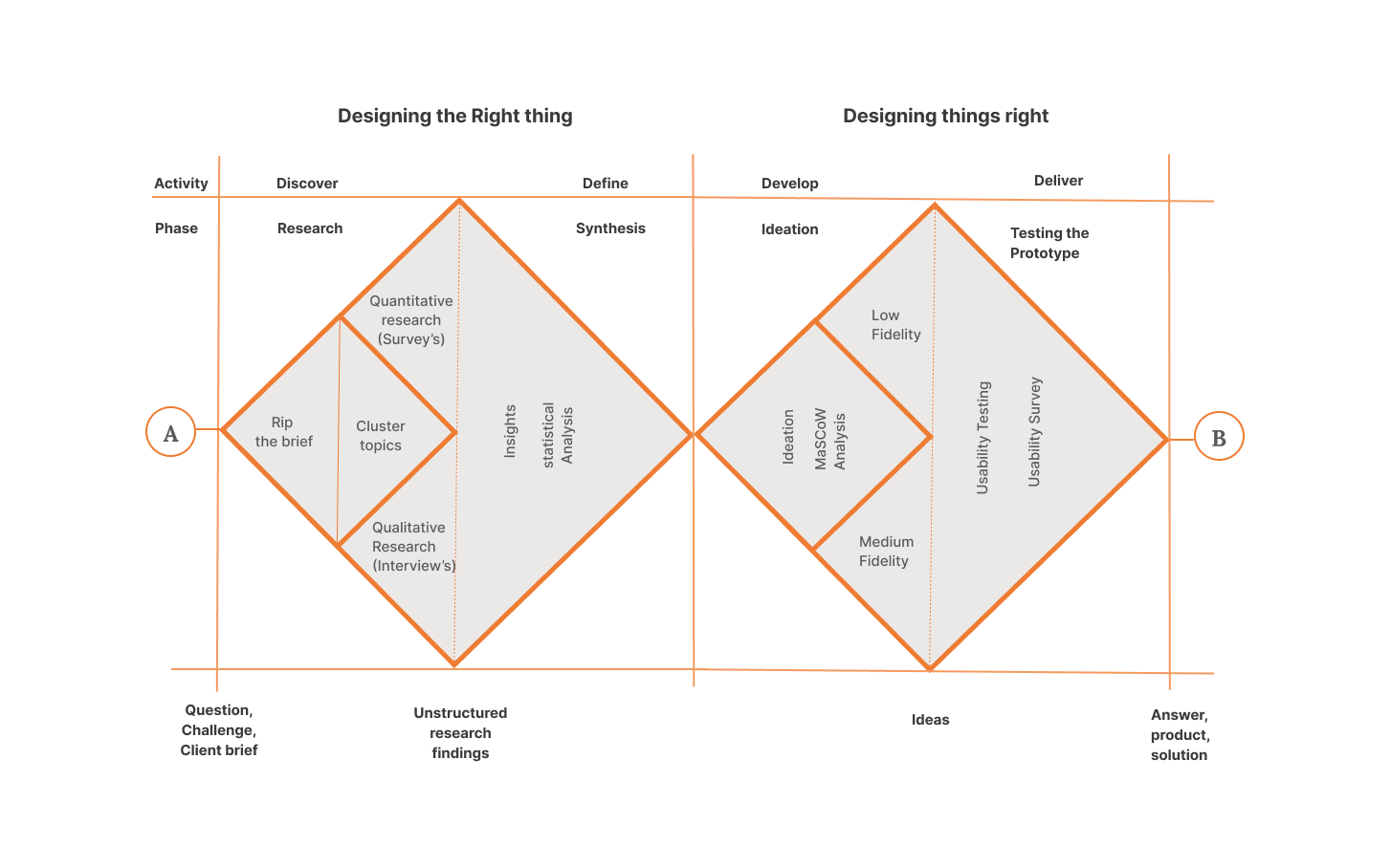
Methodology
The methodology used to manage the process development stages was the Double Diamond.
Double diamond, methodology
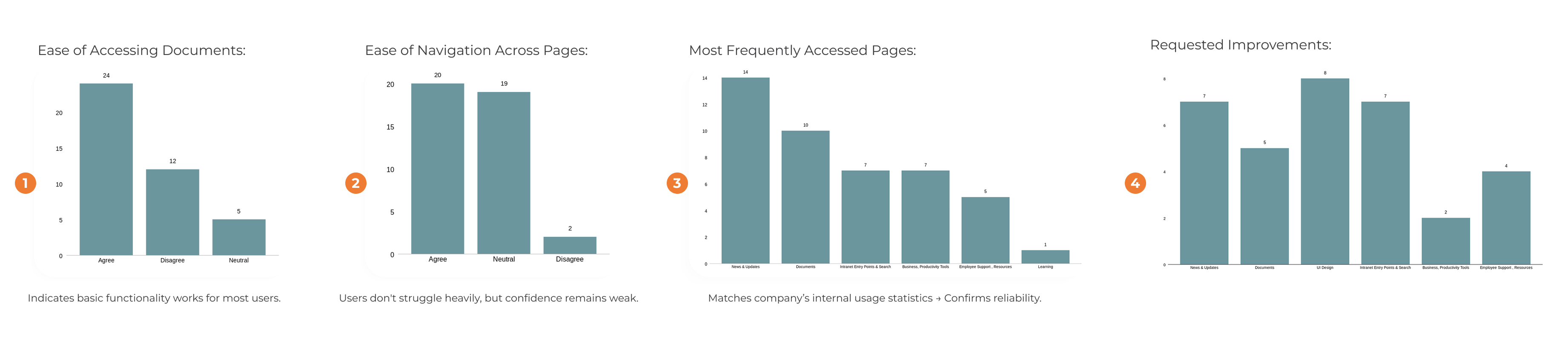
Survey Insights
Out of 42 responses, 40 were analyzed.
Document Access: 24 users said documents were easy to access, 12 disagreed, 4 were neutral (Graphic 1).
Most managed, but some still struggled.
Navigation:
20 found navigation easy, 19 were neutral, and 2 disagreed (Graphic 2).
It works, but lacks user confidence.
Popular Pages:
Most visited: News & Updates, Documents, Search, and external links (Graphic 3).
Top Suggestions: Better UI design, Improved News & Updates, Enhanced search, Clearer document structure (Graphic 4).
These insights shaped our redesign priorities.
Statistical analysis of surveys results
Interviews | MoSCoW analysis
Total of 6 interviews conducted with: Consultants; Consulting Managers; HR Professional.
From the interviews was possible to collect key responses:
. Most users rely heavily on Menu navigation.
. 50% said menu names are unclear or repetitive.
. Homepage missing calendar, search, CV quick links.
. Split opinions on adding fun polls.
. 100% requested direct CV editing link.
. Some want better grouping of documents & collapsible folders.
After concluding the static analysis, the MoSCoW methodology was essential to choose the most important features in the project, based on what users needed most.
So, key features like Documents, CV, and Search were top priority. Others like Calendar, News, and E-Learning came after.
First wireframe
The first wireframe showed the structure and main functionalities, bringing external resources to the main page, designing the intranet as a hub, being a central tool for consultants.
First wireframe - Tool FIgma
Second wireframe
The second was cleaner and better matched what DevPort wanted.
The changes are also noticeable in the sitemap, in the footer.
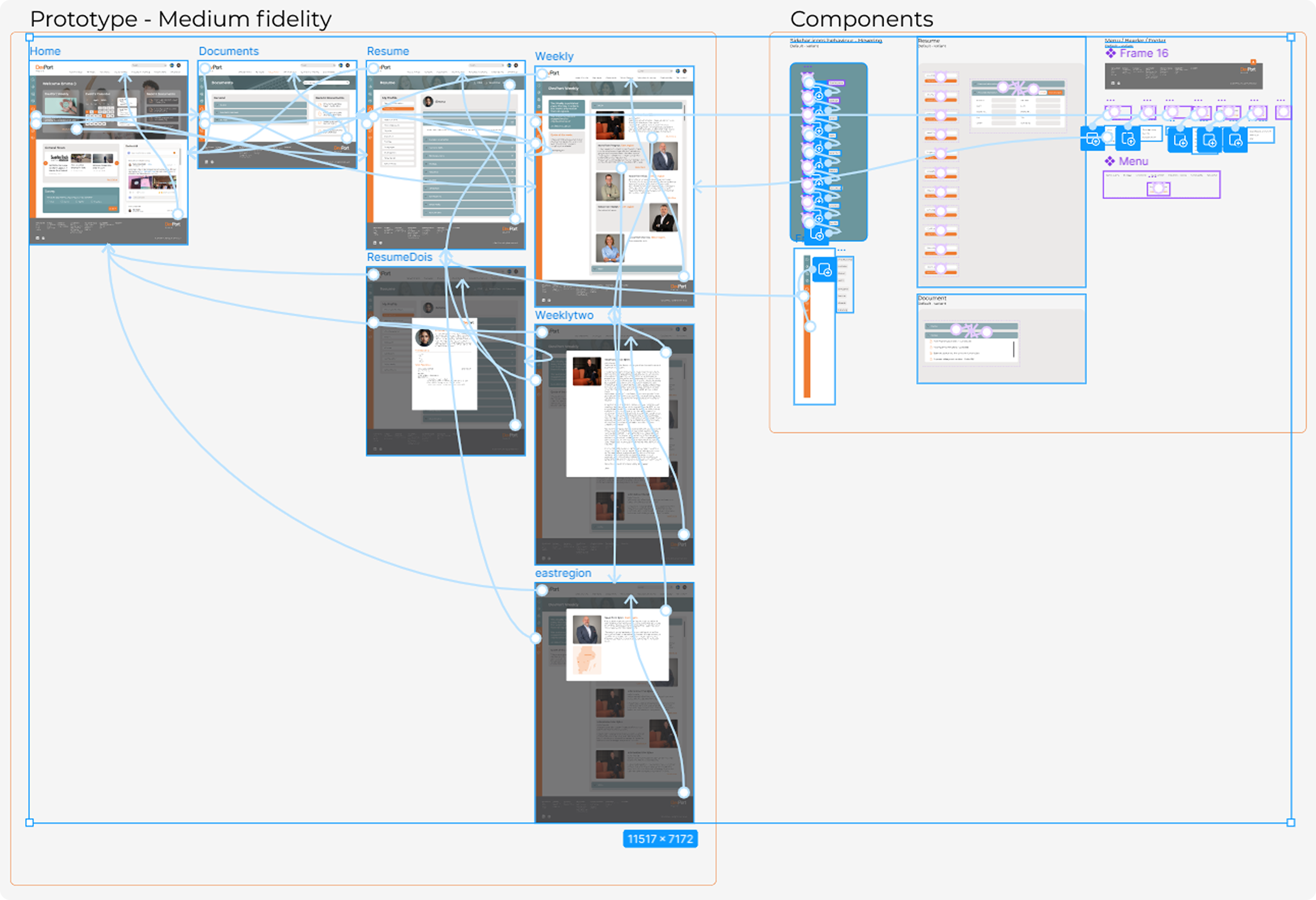
Mid-fidelity prototype
Based on the researches aligning the user and stakeholder requirements, we had defined the main pages: Home, Documents and Resume. The DevPort Weekly was done last, we wanted to show how a well-structured design can contribute to the development of a web environment.
As the Intranet is a huge system, it was selected those pages, due to our master thesis time. But we left the intranet conclusion as a future work.
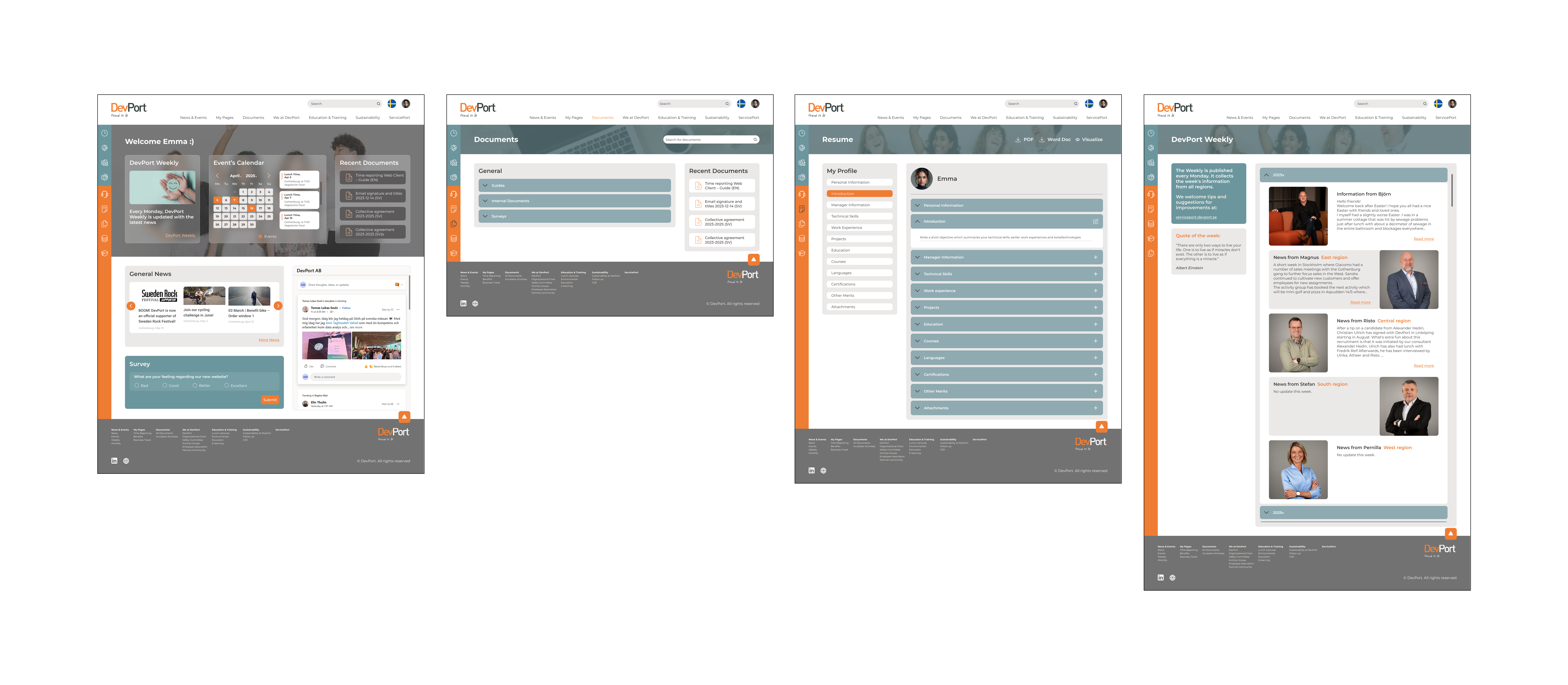
Final prototype - Home | Documents | Resume | DevPort Weekly - Tool FIgma
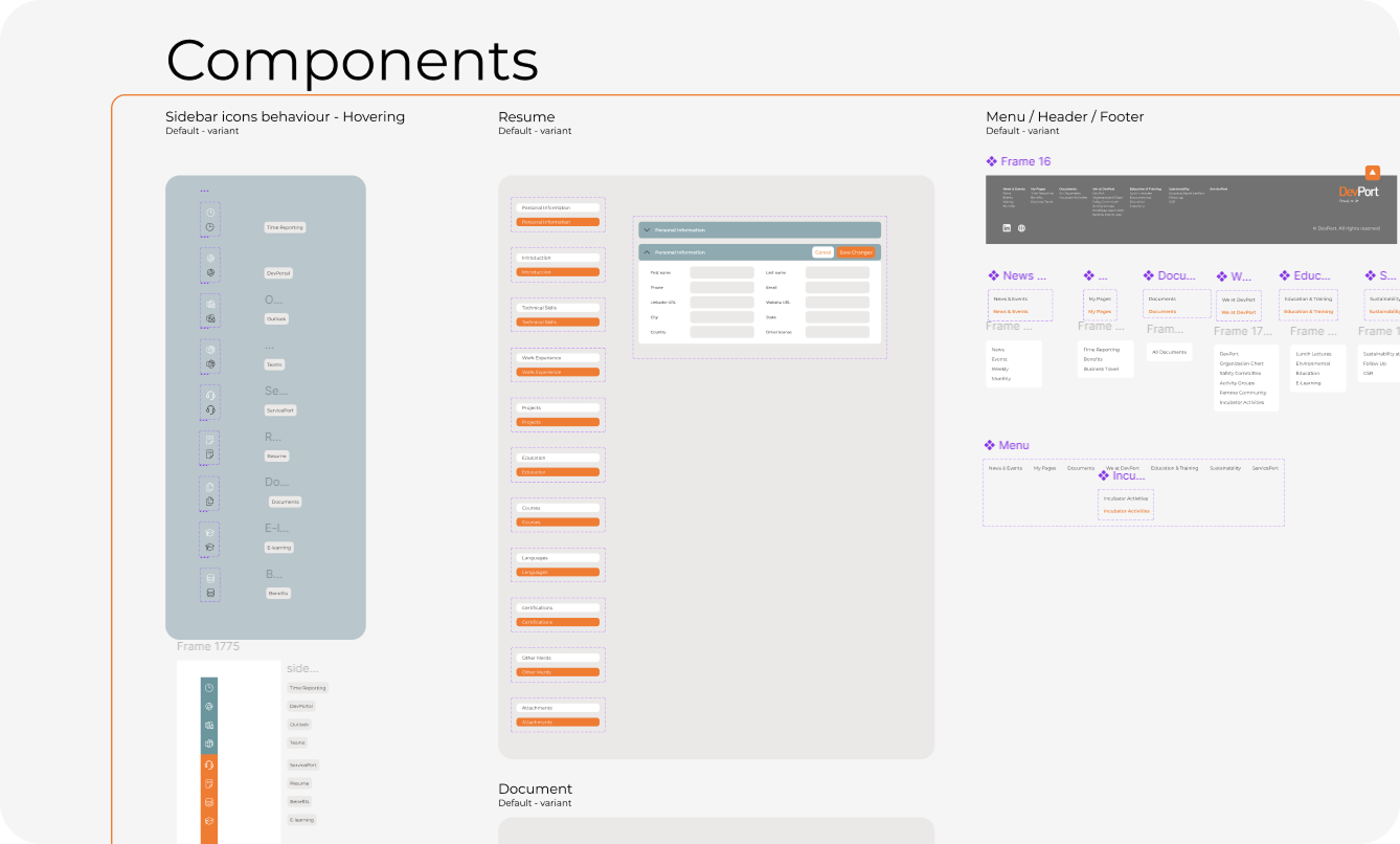
Interaction flow | Components
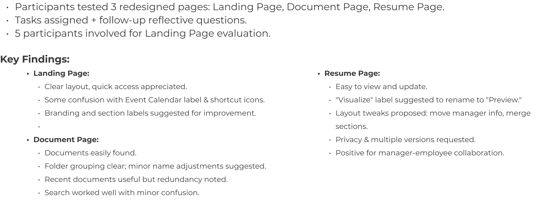
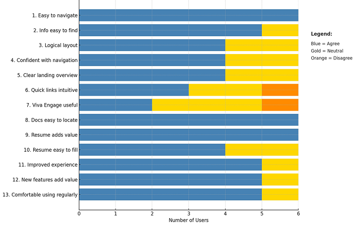
Usability testing | Usability survey
As the graph below shows, responses were mostly positive users felt the intranet was easier to navigate, and features like document access and the resume page were seen as valuable and easy to use.
Overall, this survey confirmed that the new design is intuitive, clear, and meets most of the users' needs, with a few areas identified for further fine-tuning.
Usability testing results